
Multi-Line Plots#
Multi-line plots overlay multiple curves on the same axes, each representing a different value of one or more fields. This is the primary way to compare methods, hyperparameters, or configurations visually.
Basic usage#
Use -multi_line_fields to specify which field(s) should produce separate lines:
malet-plot -exp_folder ./experiments/my_exp \
  -mode curve-epoch-val_accuracy \
  -multi_line_fields 'optimizer' \
  -best_at_max
Each unique value of optimizer gets its own line with a distinct color.
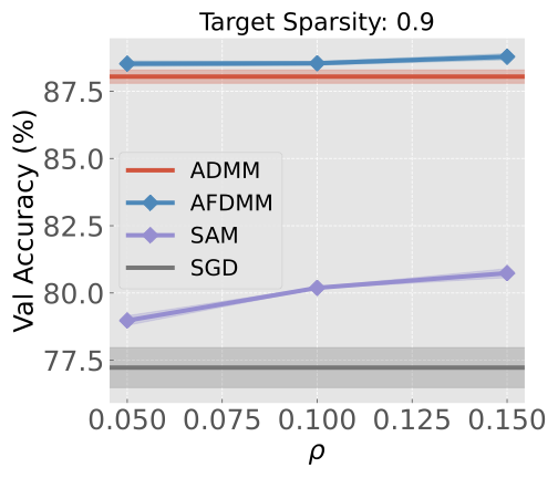
When the multi-line field has continuous numeric values (like learning rate, rho, or sparsity), Malet automatically uses a continuous colormap instead of a discrete palette:
Multiple fields#
You can specify up to 3 fields (for curve modes). Each field gets a different style dimension:
Field position |
Style dimension |
|---|---|
1st field |
Color |
2nd field |
Line style (solid, dashed, dotted, etc.) |
3rd field |
Marker shape |
malet-plot -exp_folder ./experiments/my_exp \
  -mode curve-epoch-val_accuracy \
  -multi_line_fields 'optimizer lr' \
  -best_at_max
This creates one line for each (optimizer, lr) combination. The optimizer controls the color and the learning rate controls the line style, making it easy to distinguish both dimensions simultaneously.
Style limits by plot type#
Plot type |
Max multi-line fields |
Style dimensions |
|---|---|---|
|
3 |
color, linestyle, marker |
|
3 |
color only |
|
2 |
color, marker |
|
1 |
marker only |
|
— |
not supported |
Custom colors#
Override the default color palette with -colors:
malet-plot ... -colors 'Blues Reds'
Multiple palette names are cycled across multi-line field values. You can also use specific hex colors or named matplotlib colormaps.
Legend#
The legend is generated automatically when multi-line fields are present. It organizes entries by field with section headers. Customize it via the YAML plot config:
ax_style:
  legend: [{fontsize: 14, loc: 'upper left', ncol: 2}]
Python API#
import matplotlib.pyplot as plt
from malet.experiment import ExperimentLog
from malet.plot_utils.data_processor import avgbest_df, select_df
from malet.plot_utils.plot_drawer import ax_draw_curve

log = ExperimentLog.from_tsv('log.tsv')
df = log.melt_and_explode_metric()
df = select_df(df, {'metric': 'val_accuracy'})

fig, ax = plt.subplots(figsize=(9, 6))
colors = {0.25: '#2ca02c', 0.5: '#ff7f0e', 0.75: '#d62728'}

for noise in [0.25, 0.5, 0.75]:
    p_df = select_df(df, {'noise': noise})
    p_df = avgbest_df(p_df, 'metric_value', avg_over={'seed'},
                      best_over={'rho'}, best_at_max=True)
    drop = [n for n in p_df.index.names if n != 'step']
    p_df = p_df.reset_index(drop, drop=True).sort_index()
    ax_draw_curve(ax, p_df, label=f'Noise={noise}',
                  color=colors[noise], annotate=False, std_plot='fill')

ax.set_xlabel('Epoch')
ax.set_ylabel('Val Accuracy')
ax.legend()
fig.savefig('multi_line.png', dpi=150, bbox_inches='tight')