
Curve Plots#
Curve plots show how a metric evolves over a continuous x-axis field (typically epoch or step). This is the most common plot type for visualizing training dynamics.
Basic usage#
malet-plot -exp_folder ./experiments/my_exp \
  -mode curve-epoch-val_accuracy \
  -best_at_max
This plots val_accuracy on the y-axis over epoch on the x-axis. Seeds are averaged automatically, and all other hyperparameters are optimized (best value selected).
Error bands and error bars#
When averaging over seeds, Malet computes standard error and displays it as shaded bands by default. You can switch between display modes:
std_plot: fill— shaded band (default)std_plot: bar— error barsstd_plot: none— no error display
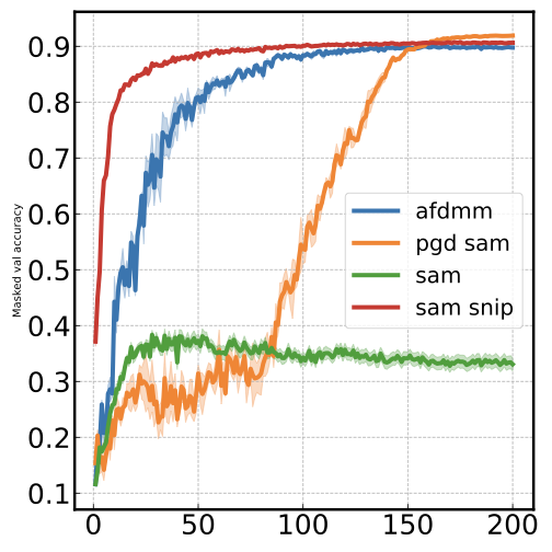
Curve with best point starred#
Use curve_best mode to highlight the best-performing point with a star marker:
malet-plot -exp_folder ./experiments/my_exp \
  -mode curve_best-epoch-val_accuracy \
  -best_at_max
This is useful for identifying the epoch where a model peaks before overfitting begins.
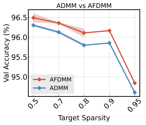
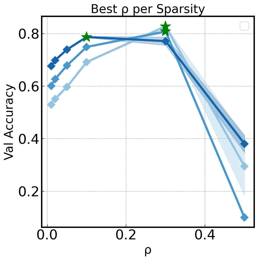
You can also use curve_best with a hyperparameter on the x-axis to find the optimal hyperparameter value:
malet-plot -exp_folder ./experiments/my_exp \
  -mode curve_best-rho-val_accuracy \
  -filter 'step last' \
  -best_at_max
Python API#
For fine-grained control, use ax_draw_curve and ax_draw_best_stared_curve directly:
import matplotlib.pyplot as plt
from malet.experiment import ExperimentLog
from malet.plot_utils.data_processor import avgbest_df, select_df
from malet.plot_utils.plot_drawer import ax_draw_curve

log = ExperimentLog.from_tsv('log.tsv')
df = log.melt_and_explode_metric()
df = select_df(df, {'metric': 'val_accuracy'})
df = avgbest_df(df, 'metric_value', avg_over={'seed'},
                best_over={'lr'}, best_at_max=True)

# Reduce to single index (step)
drop = [n for n in df.index.names if n != 'step']
df = df.reset_index(drop, drop=True).sort_index()

fig, ax = plt.subplots(figsize=(9, 6))
ax_draw_curve(ax, df, label='ResNet20', color='#1f77b4',
              annotate=False, std_plot='fill')
ax.set_xlabel('Epoch')
ax.set_ylabel('Val Accuracy')
ax.legend()
fig.savefig('curve.png', dpi=150, bbox_inches='tight')
ax_draw_curve parameters#
Parameter |
Type |
Default |
Description |
|---|---|---|---|
|
|
— |
Matplotlib axes to draw on |
|
|
— |
Single-index DataFrame with one value column |
|
|
— |
Legend label |
|
|
|
Error display: |
|
|
|
Line color |
|
|
|
Line width |
|
|
|
Marker style |
|
|
|
Marker size |
|
|
|
Show marker every N points |
|
|
|
Line style |
|
|
|
Add value annotations |
|
|
|
Uniform x-tick spacing |
When the number of data points exceeds 100, markers are disabled automatically.