
Plot gallery#
A visual overview of what Malet can produce. All figures below were generated from real CIFAR-10 ResNet20 experiment logs. Click any heading to jump to the corresponding guide page.
Curve plots#
Training and validation curves with error bands, comparing methods or sweeping hyperparameters.
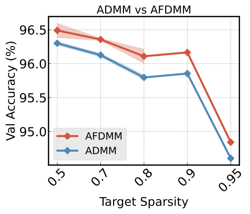
ADMM vs SAFE across sparsity levels
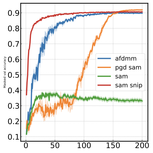
Training dynamics: masked val accuracy over epochs
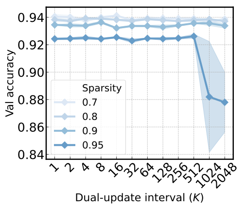
Sequential blue colormap for ordered sparsity levels
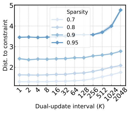
Log-log curve: penalty vs constraint distance
Scatter plots#
Metric-vs-metric relationships with multi-line encoding (color + marker shape).
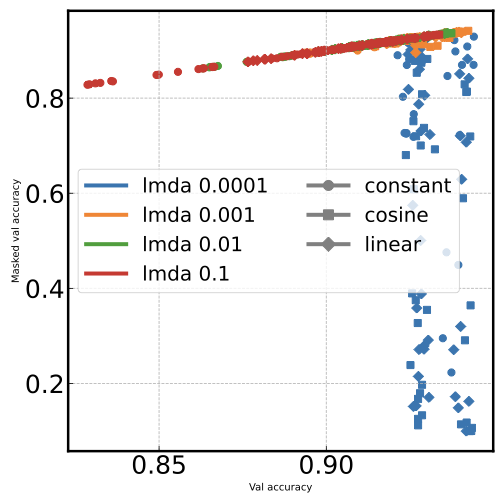
Color = lambda, marker = schedule (dual multi-line)
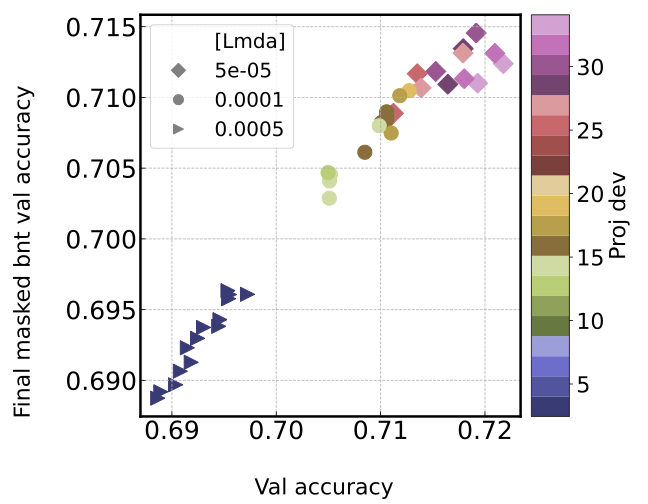
Marker = lambda, color = proj dev (continuous colorbar)
Multi-plot grids#
Subplot grids split by one or two fields.
--min.png)
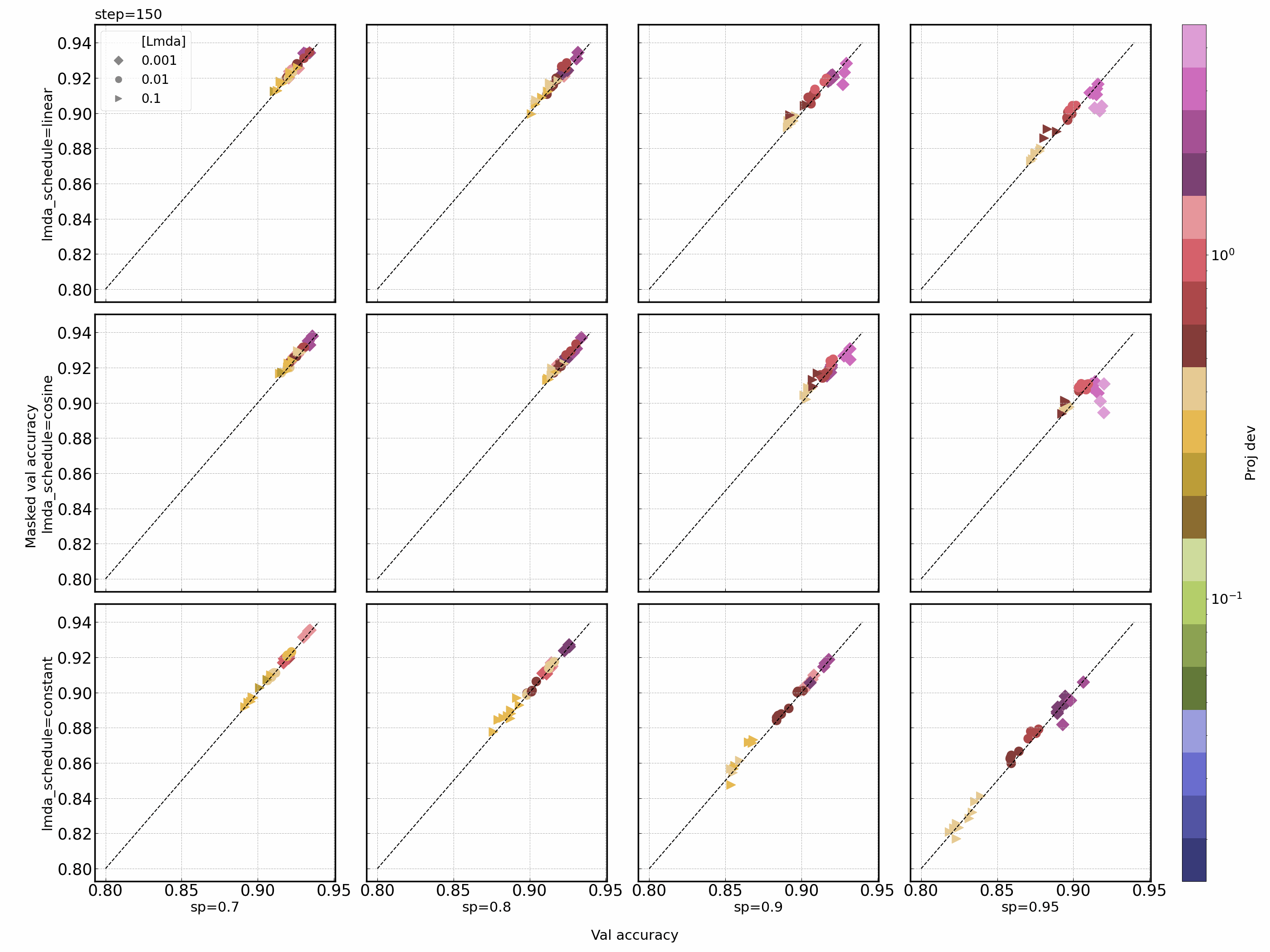
4x4 grid by lambda (columns) x sparsity schedule (rows), colored by proj dev
--min.png)
3x4 grid by lambda x lambda schedule
Multi-line#
Multiple curves on the same axes. Ordered numeric fields get sequential colormaps automatically.
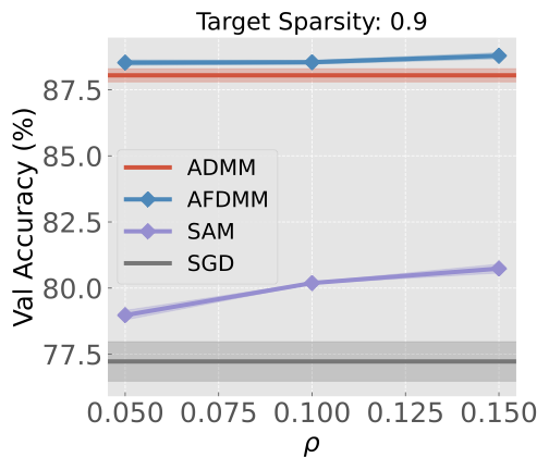
Tab10 palette: ADMM, SAFE, SAM, SGD at sparsity 0.9
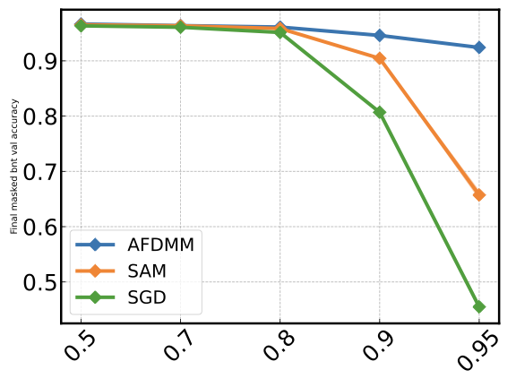
Method comparison across sparsity levels
Animation (GIF)#
Animate any plot type over time. The x-axis shows hyperparameters; the animation field (epoch/step) drives the frames.
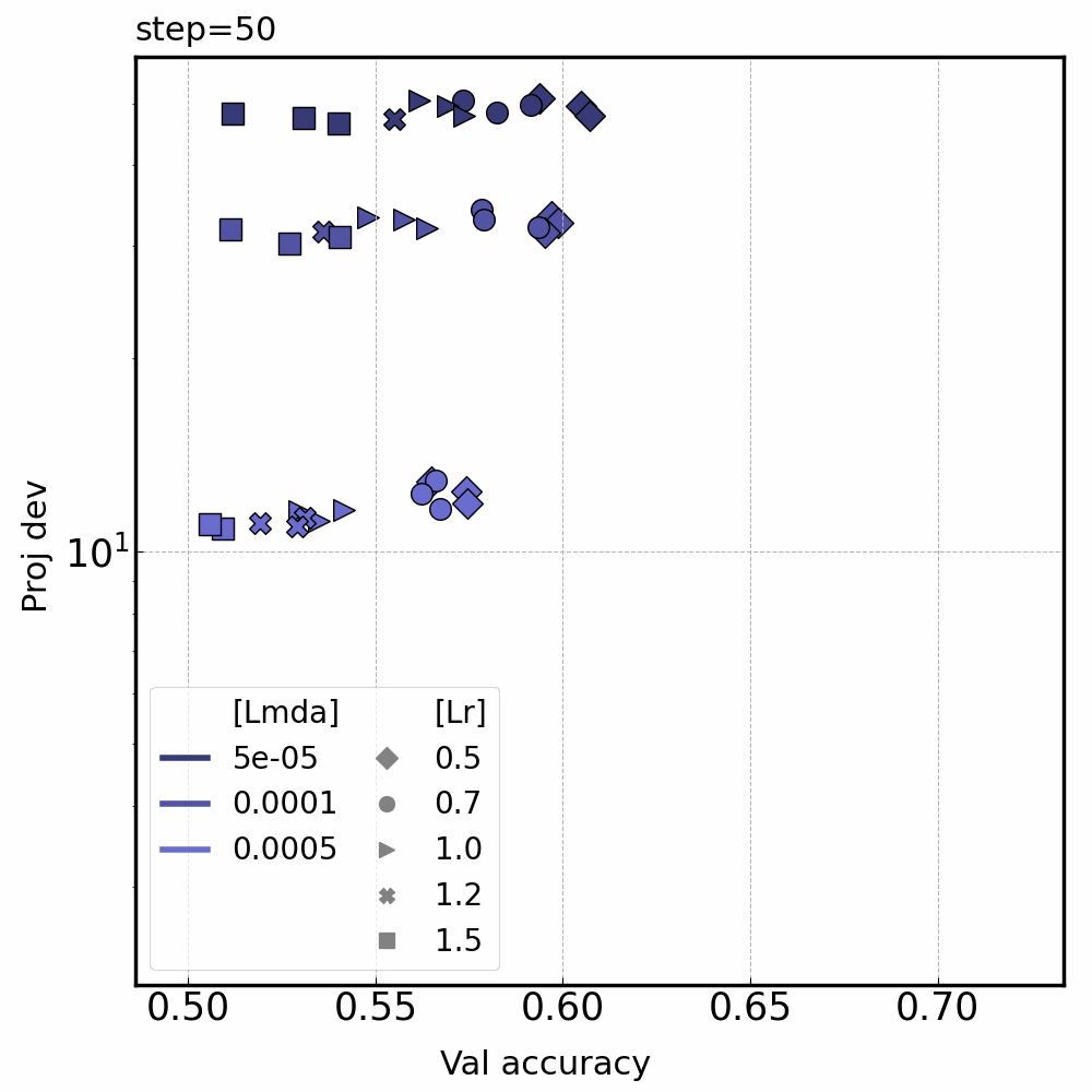
Scatter animated over steps: color = lambda, marker = lr
Faceted scatter animated over late training
Other visualizations#
Loss landscapes and custom analysis plots.
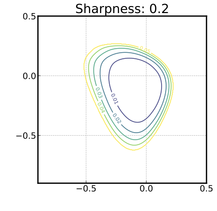
ADMM loss landscape (sharpness: 0.2)
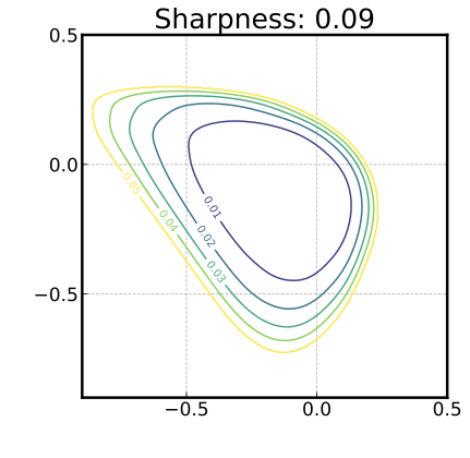
SAFE loss landscape (sharpness: 0.09 — flatter minimum)
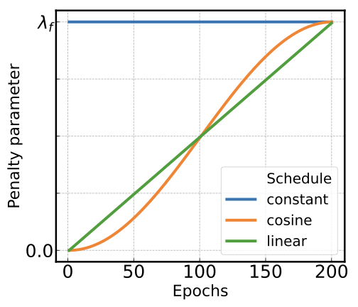
Lambda penalty schedules: constant, cosine, linear
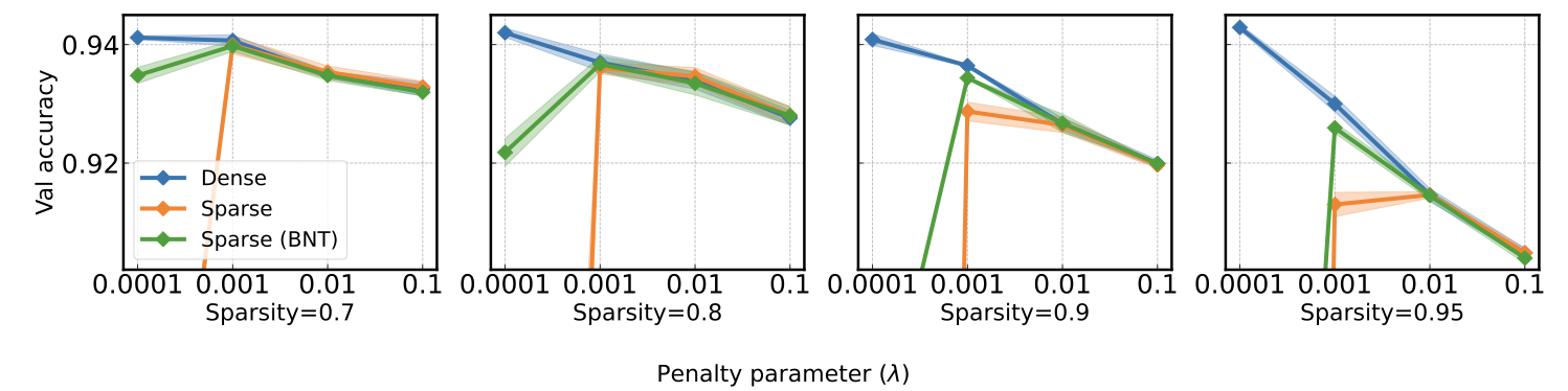
Dense/sparse/BNT accuracy vs lambda across sparsities