
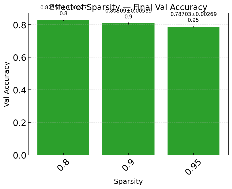
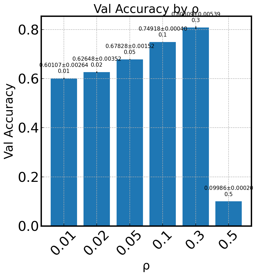
Bar Charts#
Bar charts compare a metric across discrete categories — useful for final-epoch comparisons between optimizers, architectures, or other hyperparameters.
Basic usage#
malet-plot -exp_folder ./experiments/my_exp \
  -mode bar-optimizer-val_accuracy \
  -filter 'step last' \
  -best_at_max
The filter step last selects only the final epoch, so each bar shows the terminal performance.
Error bars#
When averaging over seeds, standard error is shown automatically as error bars on each bar. Disable with std_plot: false in the YAML plot config.
Python API#
import matplotlib.pyplot as plt
from malet.experiment import ExperimentLog
from malet.plot_utils.data_processor import avgbest_df, select_df
from malet.plot_utils.plot_drawer import ax_draw_bar

log = ExperimentLog.from_tsv('log.tsv')
df = log.melt_and_explode_metric(step=-1)
df = select_df(df, {'metric': 'val_accuracy'})
df = avgbest_df(df, 'metric_value', avg_over={'seed'},
                best_over={'lr'}, best_at_max=True)

# Reduce to single index (the categorical x-field)
drop = [n for n in df.index.names if n != 'optimizer']
df = df.reset_index(drop, drop=True).sort_index()

fig, ax = plt.subplots(figsize=(7, 5))
ax_draw_bar(ax, df, label='Val Accuracy', color='#2ca02c', annotate=True)
ax.set_xlabel('Optimizer')
ax.set_ylabel('Val Accuracy')
fig.savefig('bar.png', dpi=150, bbox_inches='tight')
ax_draw_bar parameters#
Parameter |
Type |
Default |
Description |
|---|---|---|---|
|
|
— |
Matplotlib axes to draw on |
|
|
— |
Single-index DataFrame with one value column |
|
|
— |
Legend label |
|
|
|
Show error bars if |
|
|
|
Bar color |
|
|
|
Add value annotations above bars |
|
|
|
Uniform x-tick spacing |